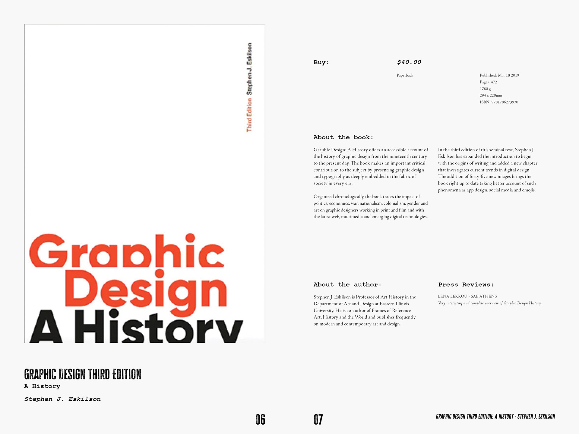
Laurence King Publishing was established in 1991 in London, England. I wanted to pay a homage to the roots of the print press. This is why a rough, bold type was chosen for the titles, because it was the closest representation of the letter blocks that are used in print press typography. Typewriter monotype was chosen for the subtitles, as well as a more modern-looking version for the body type. The goal that I had for the layout was that the books were put on display, but the type system was strong with its alignments. This is also the reason why I chose to keep a black and white color palette, so the books could be the only source of color!