Abstracted Alphabets
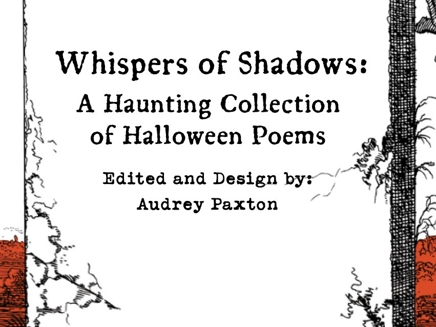
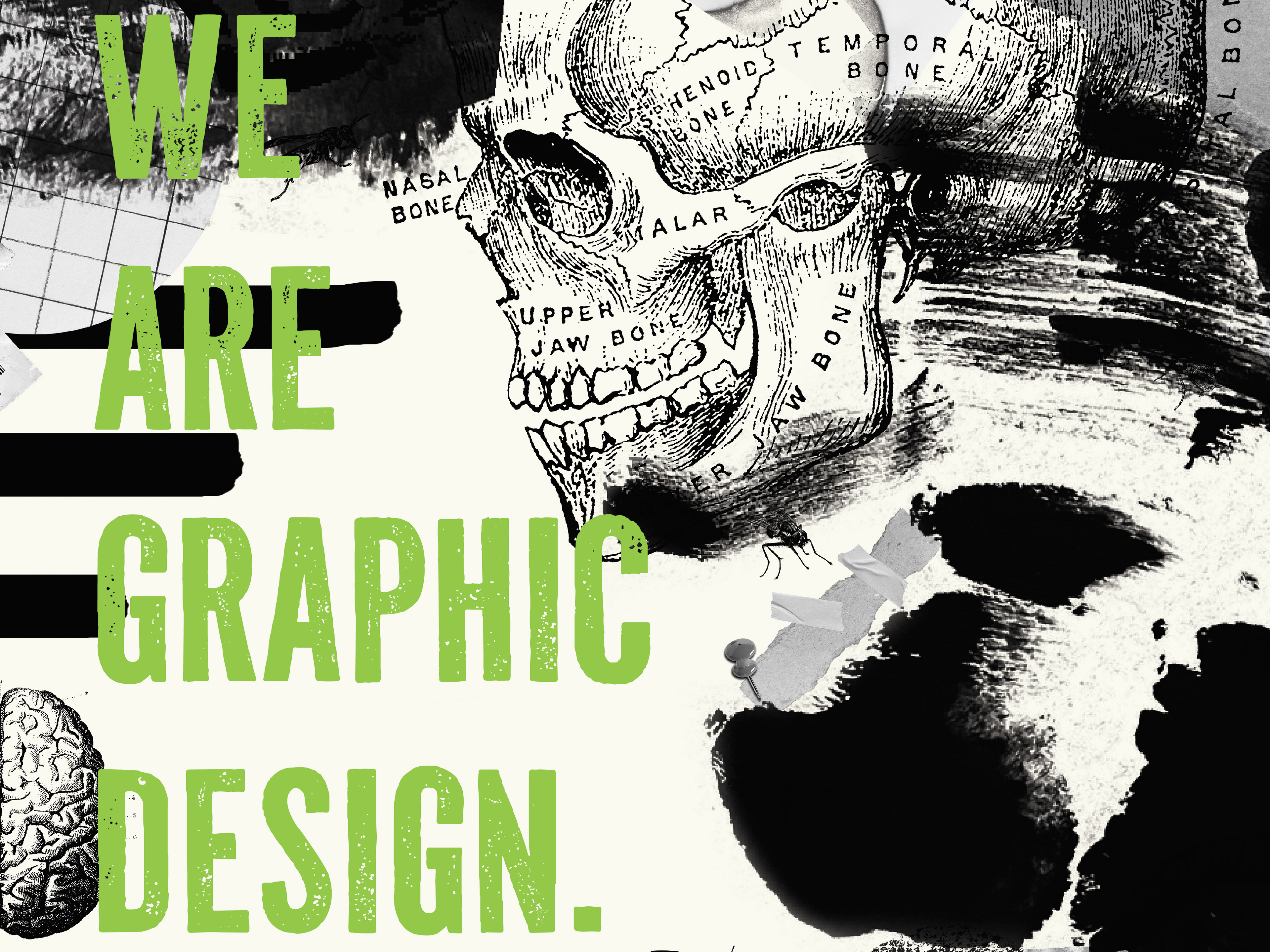
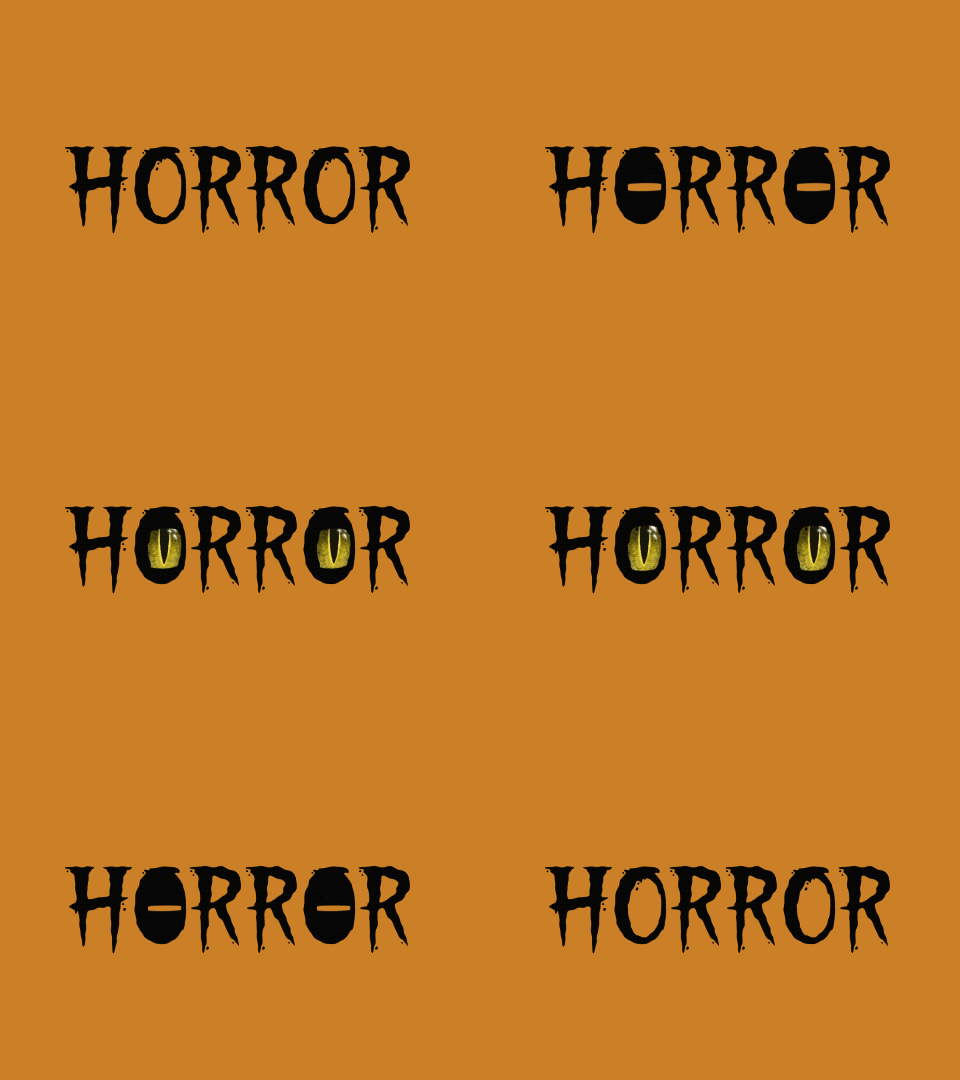
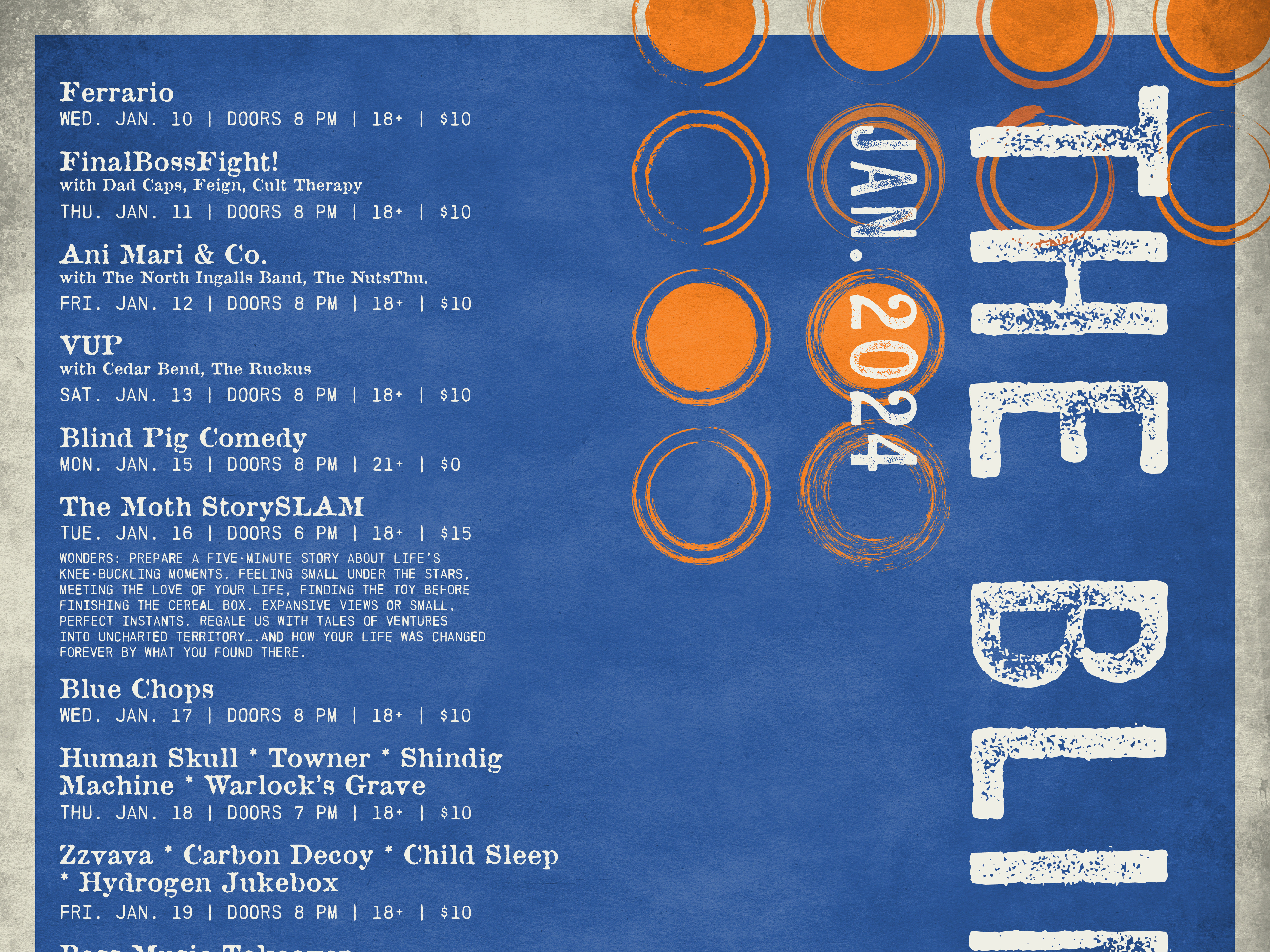
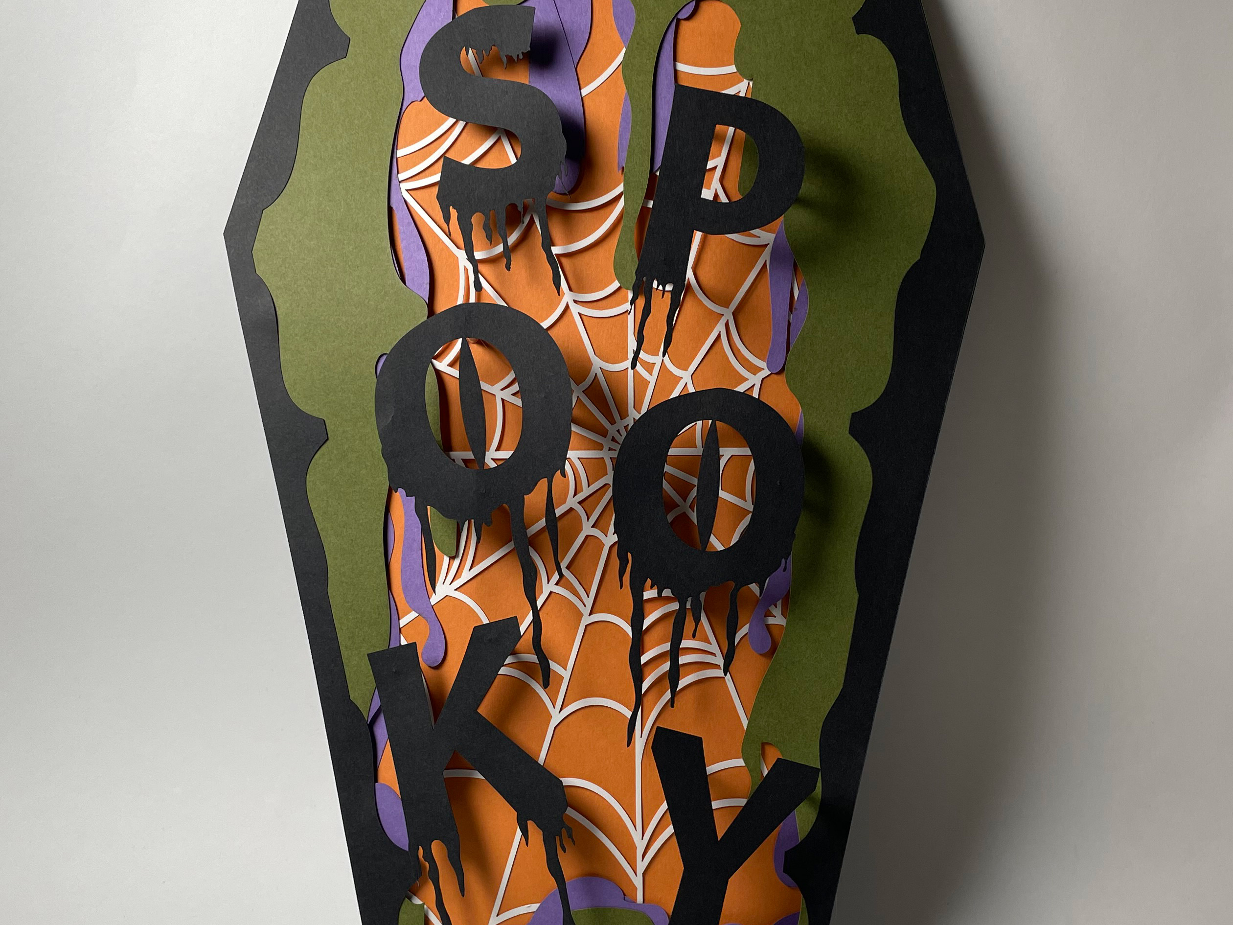
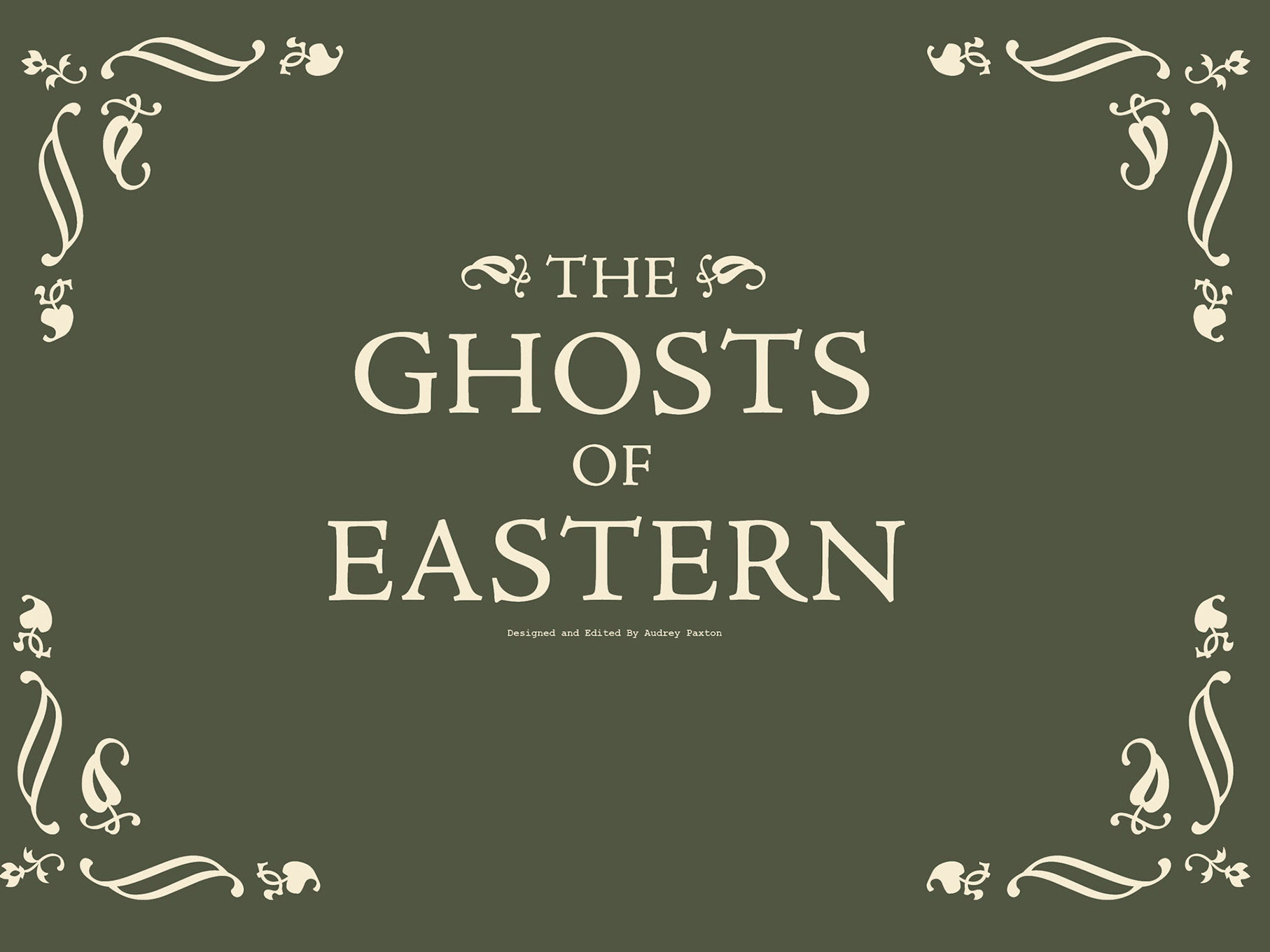
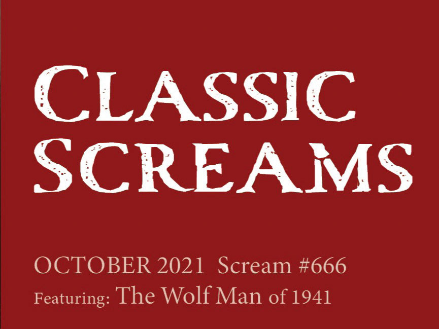
The Abstracted Alphabets project is about event posters that we were asked to incorporate an image to illustrate what we thought would catch the eye of the viewer. Since the class is about experimenting with type, why couldn't the type be the image itself? I played around with negative space and scale to give the title its hierarchy, and split the words to give the viewer interest to see what it is about, even if it's from a distance.
Poster 1: 11 x 17", matte paper & Poster 2: 18 x 24", matte paper
ADGD 323: Experimental Typography, EMU
