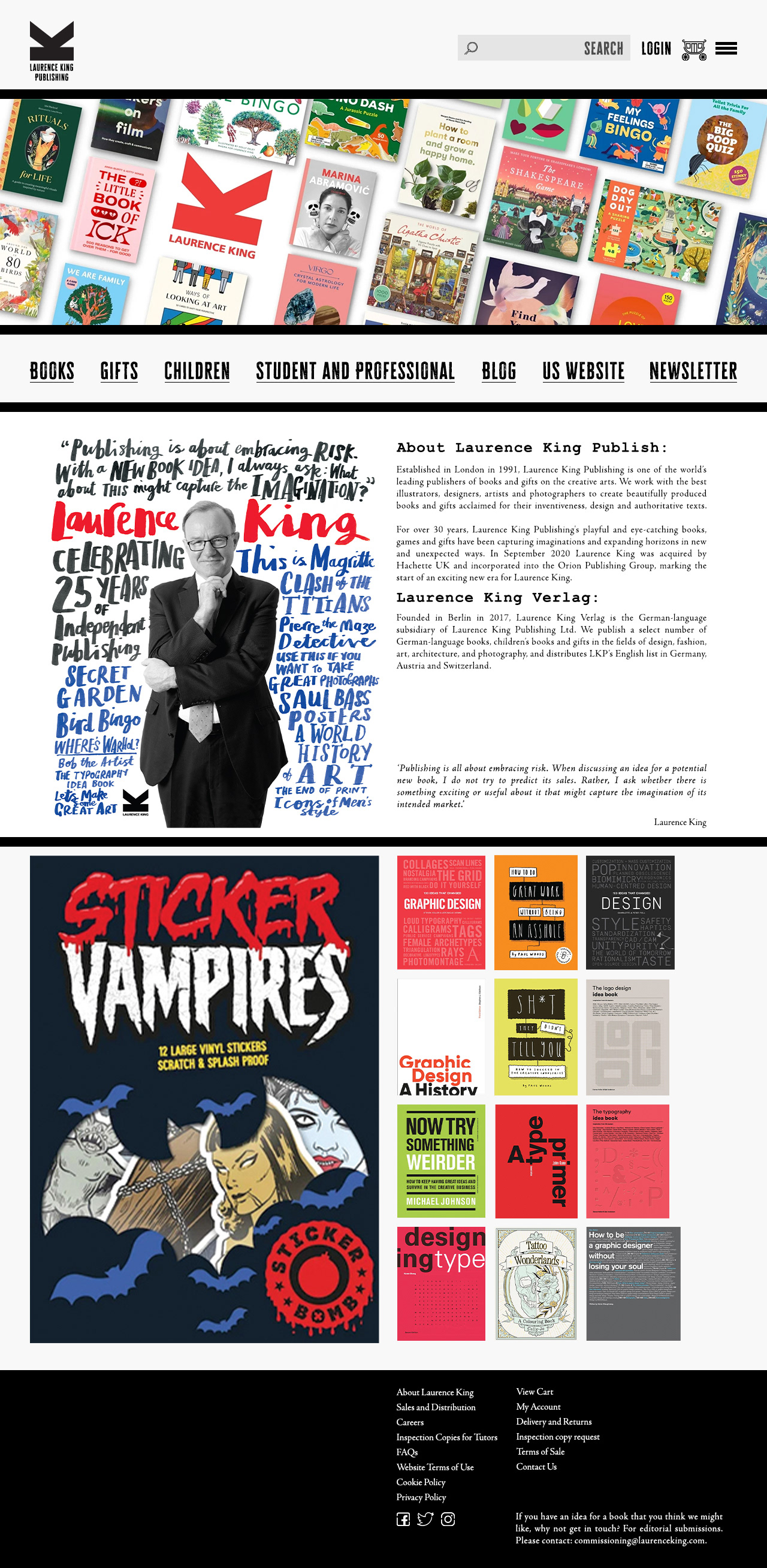
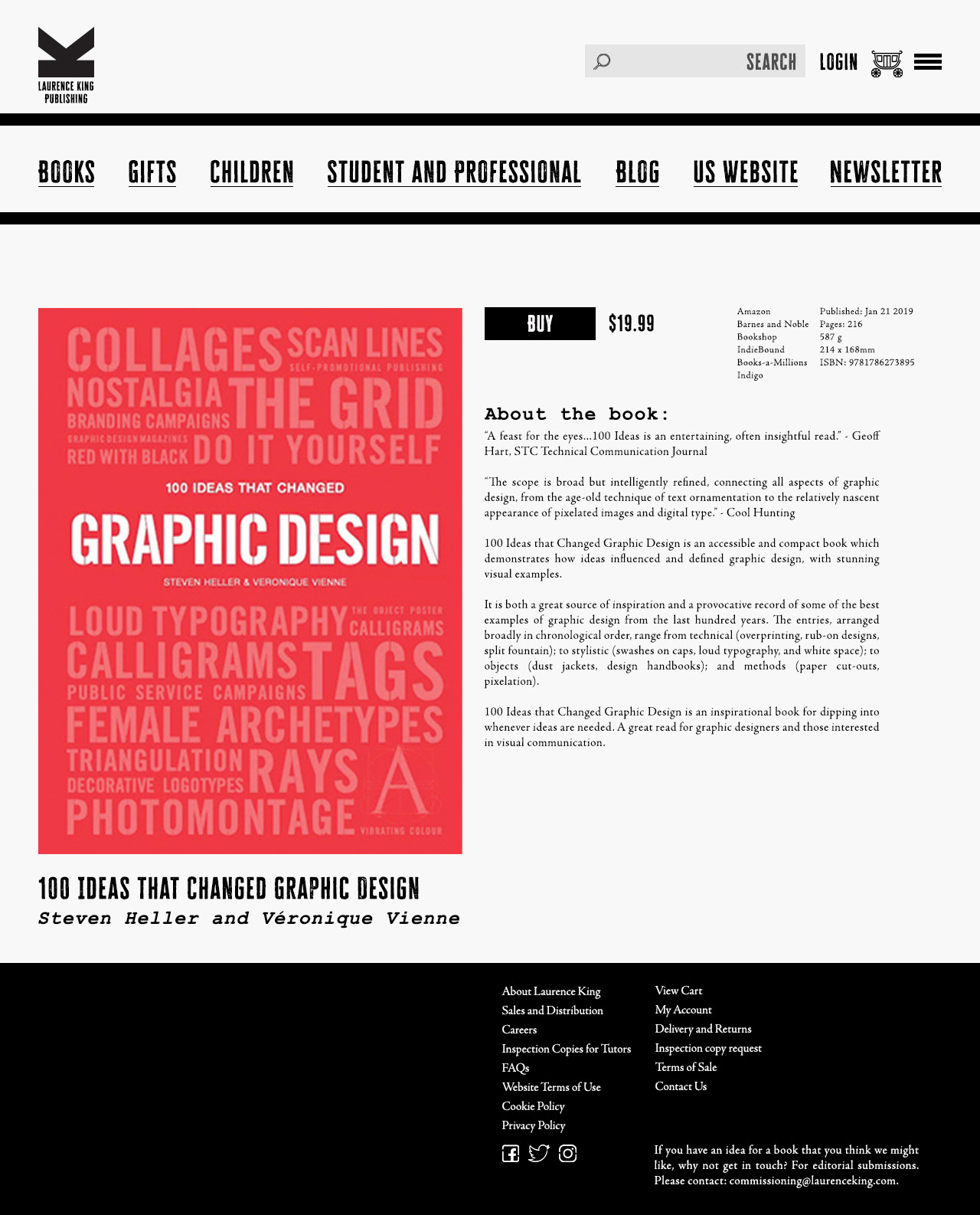
The Laurence King Website was based on the catalog design. The imagery is the only source of color in order to make them the main subject. The homepage was designed with a strong alignment grid to reflect the type system in the catalog. However, the elements of black bars were introduced to help give the homepage and second-level pages a sense of hierarchy. The second-level pages were designed with the same system as the pages in the catalog, but because they were on a web page, their negative space was tightened up in order to include the button elements.